The cornerstone of a great partnerships program is your partner portal — the tailored interface your partners sign into on your partner platform, distinct from your dashboard. It’s a one-stop shop where new partners can apply, and existing partners can collect payments and get access to resources, reports, announcements, and so on.
As we’ve written before, “a great partnerships platform doesn’t simply make it easier for you to manage your program, it makes it easier for your partners to succeed in your program — keeping them engaged and driving more long-term revenue.” After all, you as a vendor cannot succeed without your partners. When vendors invest in a positive partner experience, they also invest in their revenue for the long run.
As a partnerships platform, we’re always working towards improving our portal to create a better partner experience. That’s why we spent time speaking to our vendors to understand what changes would help their partners thrive. These conversations helped us pick four key goals to tackle with our portal refresh: improve usability, raise brand recognition across vendors, simplify navigation, and strengthen reporting capabilities. Here’s what we changed to deliver a better partner experience.

1. Simplifying payouts to make it easier for partners to withdraw their funds
Payouts are one of PartnerStack’s standout features. No other partnerships platform offers built-in payouts. They may attribute conversions and store contact information, but vendors who use other platforms still have to pay their partners manually.
While we already had payouts integrated into our platform, we knew there was more we could do to make the process more seamless and easy to use. Our overall goal was to increase transparency for partners accepting payouts, and by extension, enhance their trust in the PartnerStack platform. To do this, we broke the payments experience into chunks and focused on making improvements that would enhance the partner experience at every stage.
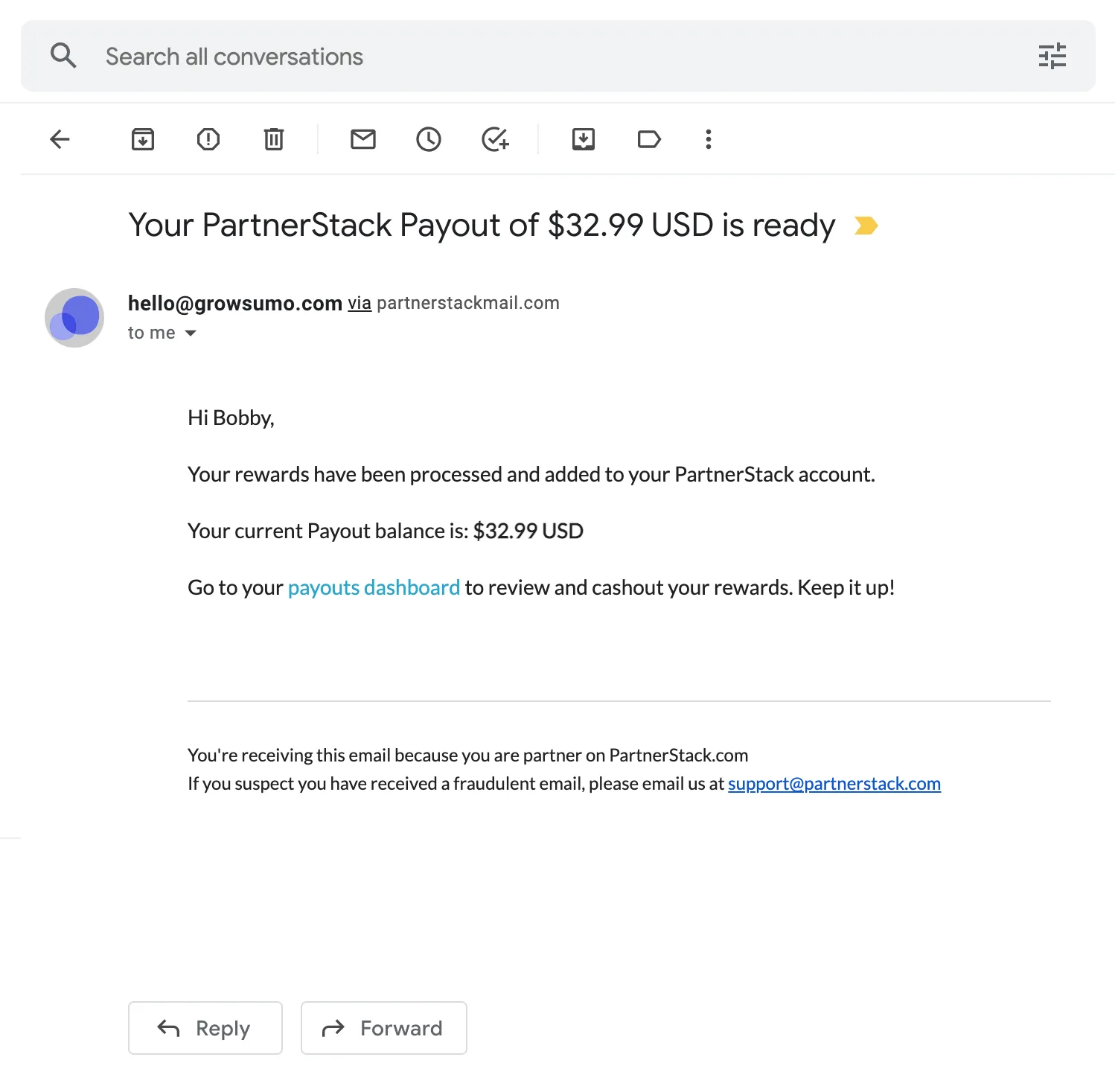
First, we redesigned the email that partners receive when they are notified that they have funds available to withdraw. We made our PartnerStack branding more prominent, so there was no confusion as to who the email was coming from, and added a big CTA for partners to withdraw their money.
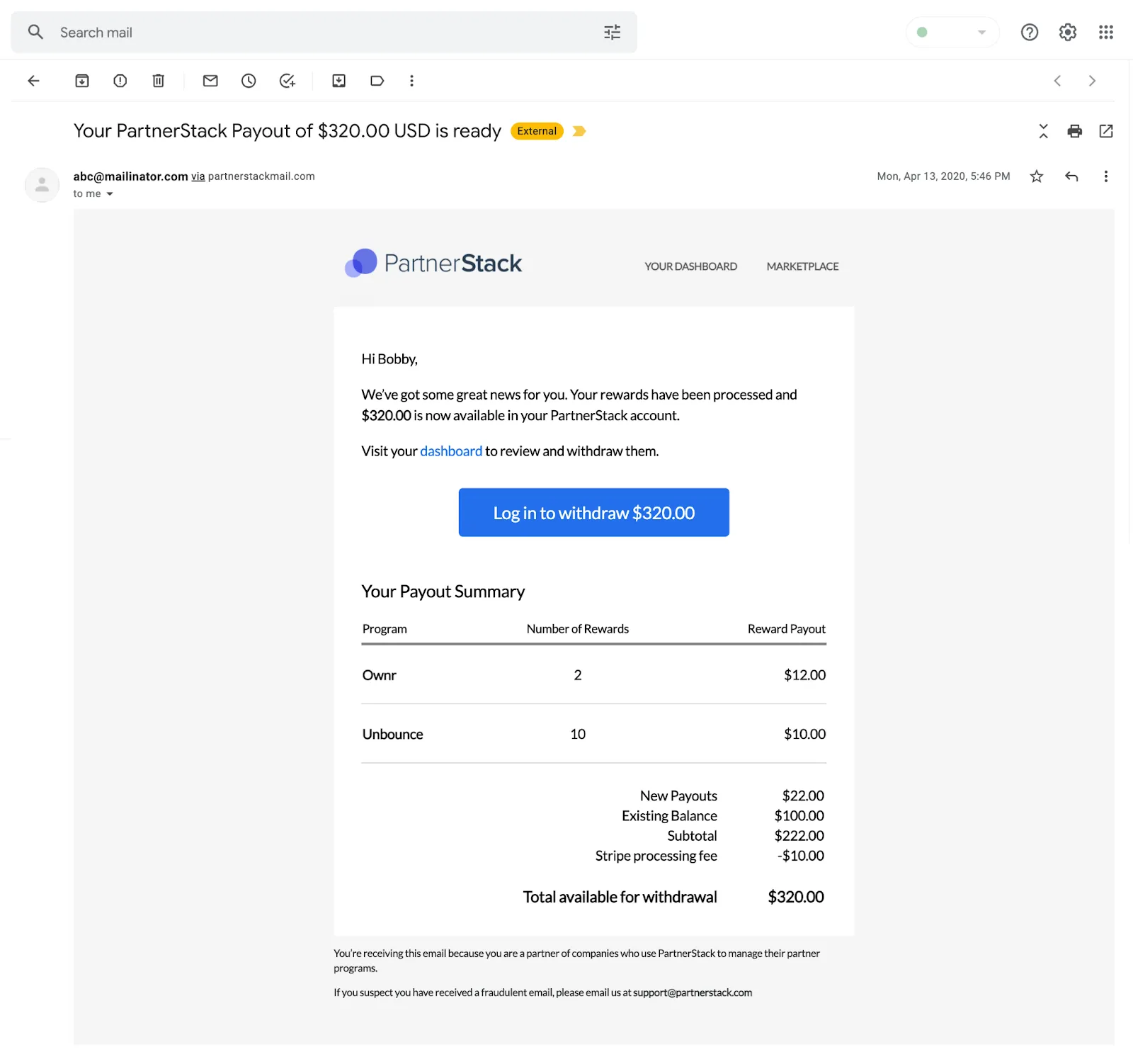
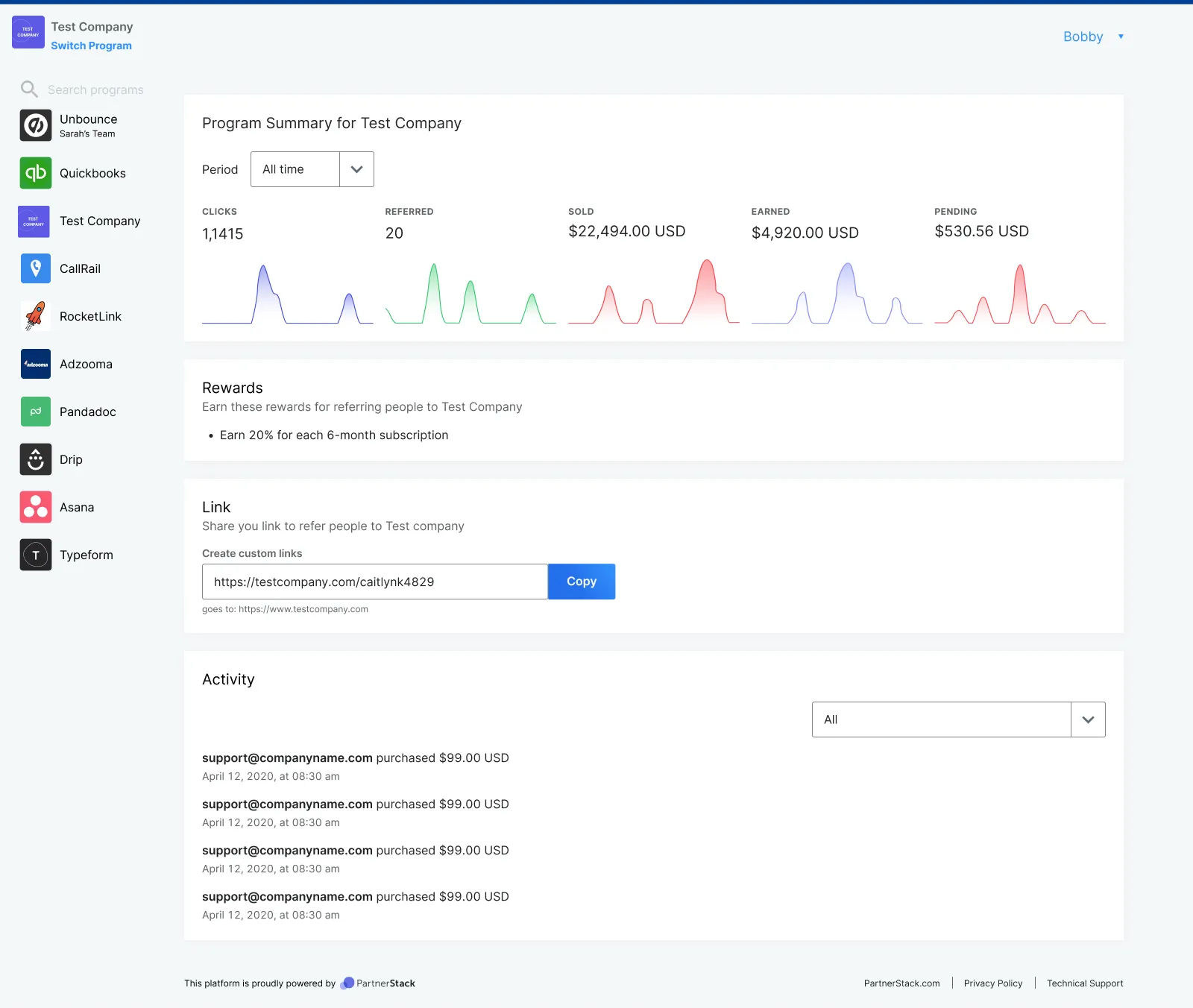
Next, we turned our attention to simplifying the Payouts page itself. During our conversations, we heard the same request from many of our partners: I want to know when I am going to get paid and how much. Our current page provided that information but did it using multiple tables (payouts, pending, drip, declined) and did not provide a clear action to make a withdrawal, which made it difficult for partners to parse.
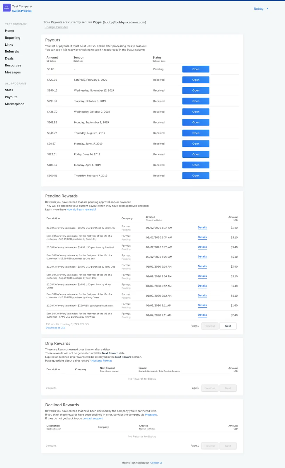
We added a withdrawal component to the top of the page, so partners can see a summary of their rewards and payment information at a glance — and most importantly, easily withdraw available funds. This withdrawal component dynamically changes based on where a partner is in the rewards lifecycle. When they first log into the portal, they’re prompted to set up their payment information via PayPal or Stripe. Once they’re set up, they can see their payout provider and the email associated with the account, as well as any associated fees, so there’s no confusion about where their money goes after they withdraw it.
Then, we condensed the multiple sections on the page into one table with a Rewards tab and a Withdrawals tab. Instead of having a separate table for each phase in the process, we added a Status column so partners can check their progress at a glance. If they need more details, they can click into any reward to see more information.
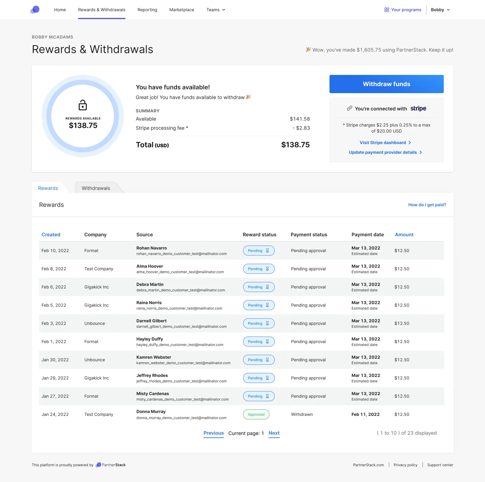
One other small but impactful change you might notice in the top right-hand corner of the screenshot is a short sentence summarizing the partner’s lifetime earnings (“Wow, you’ve made $X with PartnerStack. Keep it up!”). Anecdotally, we’ve heard from users that this is very motivating. “One of my favorite things is the payout number on the top right corner of the withdrawal page,” said one partner. “I just love that it says how much money you’ve made in an easy way.” All in all, these changes make it easier for partners to keep track of payments, collect their funds, and stay motivated.
2. Adding vendor customization to create distinct brand experiences
Many partners participate in multiple programs on PartnerStack. This is undoubtedly a positive thing — our research shows that partners who participate in multiple programs earn up to 8.6x more from PartnerStack than those who only participate in one.
But until recently, there was minimal customization that vendors could add in order to translate their brand into the partner portal, which left each program page looking quite similar to the others. This could be confusing for multi-program partners navigating between different vendors. Our vendors also expressed a desire to customize the look and feel of their partner portals. They wanted their partners to feel like they’re a part of their particular program and for the brand experience to be carried through.
After consulting with our customers and partners for feedback, we got to work. We took the branding elements we already had in place — such as the logo and customizable brand color — and made them much more prominent. We also expanded the logo treatment and customization beyond the program homepage to application pages, other pages within the program, and email templates for consistent brand recognition.
As a result, vendor pages now appear very visually distinct. Additionally, we’ve given vendors the option of customizing an announcement banner that displays at the top of their portal, so they can keep partners up to date with company events and information.
These changes benefit both vendors and partners. Vendors have more control over the partner experience and can easily share updates with their partners. Partners enjoy a much better experience when navigating the portal. It's much clearer which vendor's homepage they're looking at, it's easy for them to recognize the brand, and messages from the vendor(s) they work with are prominently displayed.
3. Improving ease of navigation for multi-program partners
Related to customization, navigation was another area we knew we wanted to refresh to provide clarity for our multi-program partners. In the past, all of our navigation links were in one menu, which caused confusion to partners as to whether they were viewing a program-specific page (like a particular vendor’s resources) or an "all programs" page like Rewards & Withdrawals.
For instance, when multi-program partners went to look at their reports, they were often unsure whether they were looking at reports for the specific program they were currently viewing or reports for all the programs they had joined. We wanted to make it easy for our partners to navigate the portal regardless of whether they participate in one program or many.
To improve ease of navigation, we separated the links into two different navigation bars: Program-agnostic links moved to the top bar, while program-specific links moved to the vendor homepage. This makes it much clearer which pages are associated with vendors, and which apply to all programs. Additionally, the top bar now has a drawer that pops out to let partners switch between programs or search for one in particular, which is especially useful for multi-program partners (see below).
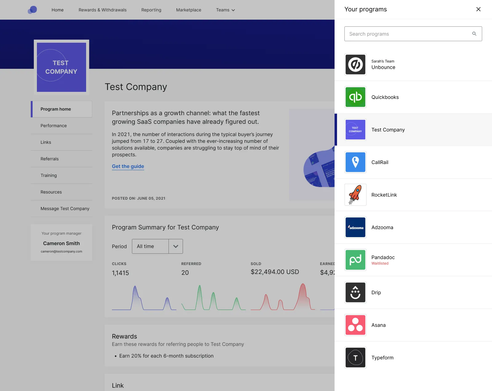
By separating our navigation into these two clearly defined sections, our partners are now able to quickly identify whether they’re on a program-specific or general page, and easily toggle between programs.
4. Improving reporting to help partners better understand their performance
Partners accrue so much data over the course of their relationship with a company. Our old interface for partners made it difficult for them to know what data to look at, and how to use it.
While partners previously had visibility into link clicks, free sign-ups, paid customers, and rewards earned on a per-program basis, this could be a source of confusion for multi-program partners or those whose vendors provided rewards based on other actions. If they were part of multiple programs or earned revenue from leads, deals, or miscellaneous actions (events that can be set up and customized by each vendor), they couldn't get a quick understanding of how much they were making, and from what activities.
To simplify the reporting experience and make it easy for partners to understand their data, we added two brand-new dashboards to the partner portal. These offer complete visibility into how many sign-ups, paid customers, transactions, and rewards a partner has received in a given timeframe, as well as the status of any rewards they have earned.
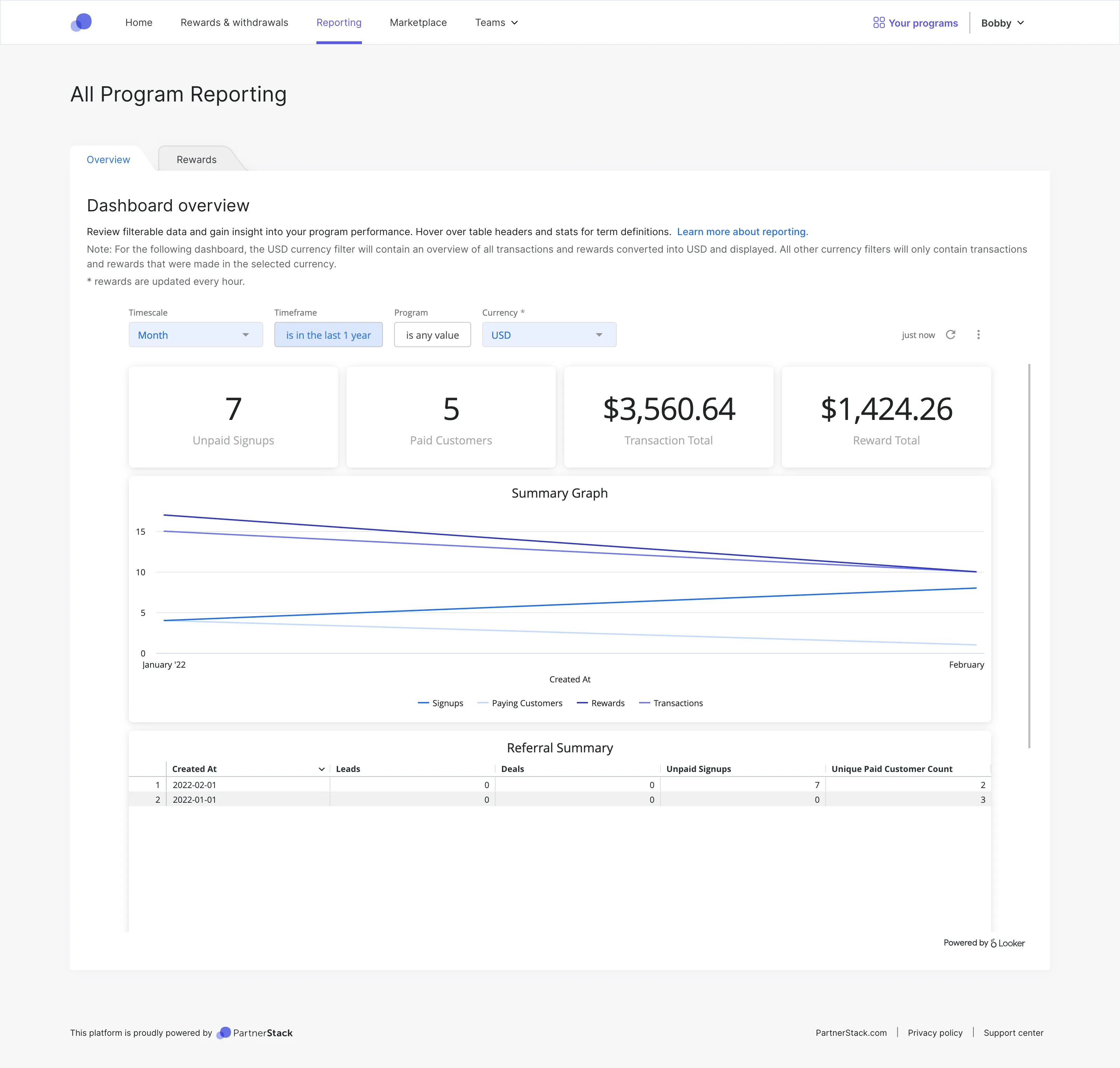
On the first dashboard, partners can manipulate these dates, and filter by vendor to isolate their performance for a single program, or across multiple programs. They can track performance on a daily, weekly, monthly, quarterly, or yearly basis to provide reporting and create projections.
On the second dashboard, partners can get information about the status of rewards they have earned (pending, paid, withdrawn), and also get more granular information about what efforts earned them that reward. This is incredibly helpful for partners who want to understand how to make more money.
For example, John Smith could see that 50% of his rewards in the last month were driven by a product with product key XYZ, but he had only allocated 5% of his marketing budget towards it. Next month, John could put a higher percentage of his marketing budget behind the XYZ product line to try to get a higher return.
These changes give partners the ability to access reporting on their own, understand their performance, and take action that helps them earn more revenue.
Fresh, but far from finished
Creating an appealing and intuitive partner portal experience is a critical part of our mission at PartnerStack — it supports our partners’ hard work, and in turn, makes our vendors more successful. In our recent redesign, we made a number of significant changes, making it easier for our partners to get paid, navigate between different programs, receive communications from the vendors they work with, and understand their own performance.
While we’ve made great strides so far, we’re far from done. We’re going to continue to work hard to create the best partner portal experience possible, for both our partners and our vendors.